flowchart
  mc3_json[/in: mc3.json/]
  sn_rds[/out: supernetwork.rds/]

  read[Read Input]
  clean[Clean Data]

  degree[Calculate degree centrality]
  pagerank[Calculate pagerank centrality]
  betweenness[Calculate betweenness centrality]

  plot_corp[Plot corporate structures]
  plot_network[Plot network graphs]
  plot_influence[Plot influence]
  shiny_app[Shiny App]

  combine_data[/Combine based on requirement\]
  combine_plots[/Combine plots\]

  clean -- save --> sn_rds
  mc3_json --> read

  subgraph Data Preparation
    read --> clean

    subgraph transform_data[Transform Data]
      extract_subnetwork[[Extract subnetwork]]
      filter_date[[Filter by date]]
      transform_power[[Transform power graph]]

      extract_subnetwork --> combine_data
      filter_date --> combine_data
      combine_data -.-> transform_power
    end

    clean --> transform_data
  end

  subgraph Statistical Analysis
    combine_data -.-> degree
    transform_power --> pagerank
    transform_power --> betweenness
  end


  subgraph Data Exploration & Visualization
    degree --> plot_corp
    pagerank --> plot_influence
    betweenness --> plot_influence
    transform_data --> plot_network
    plot_corp --> combine_plots
    plot_network --> combine_plots
    plot_influence --> combine_plots
    combine_plots --> shiny_app
  end
Project Proposal
Motivation
The motivation for this project stems from the urgent need to combat illegal fishing activities in the sensitive marine ecosystem of Oceanus. FishEye International aims to protect this environment by monitoring and analyzing business activities of commercial fishing operators. This project seeks to enhance the ability of FishEye’s analysts to visualize and understand complex business networks, and further aiding in the detection and prevention of illegal fishing.
Objectives
This project aims to build an interactive visualization tool to enable FishEye’s analysts to effectively interpret the following changes related to illegal fishing on the business community:
Temporal patterns and corporate structures: Highlight temporal patterns and corporate structures changes for analysts to track shareholders over time.
Business Transactions: Identify typical and atypical business transactions and infer the motivations behind these activities.
Network Influence: Examine how the influence of a company changes over time within the business network.
SouthSeafood Express Corp Network: Visualize the network associated with SouthSeafood Express Corp and analyze how the network have changed due to the illegal fishing incident. Identify companies that benefited from SouthSeafood Express Corp’s legal troubles and potentially related transactions.
Data
The project will examine the data from VAST Challenge 2024 Mini-Challenge 3. The data contains the network for Oceanus’s commercial fishing business community. It contains 60,520 nodes, 75,817 edges, and 4,782 connected components.
Each node represents the entities in the fishing business community (including people and organizations). The edges represent the relationship or transactions between each pair of connected nodes.
Methodology
Data Preparation: Cleaning and shaping data to what is needed for analysis.
- Network and temporal data to enable getting the network state at any given time.
- Non-network data for accompanying information, if needed (e.g. products and services)
- Writing helper functions to generate the following subgraphs for closer analysis
- Getting subgraph based on proximity to a given node
- Getting the network state, i.e. nodes and edges present at any given time.
- Transforming relationshion graph to power graph for use in calculating influence
Statistical Analysis: To apply statistical methods to help in analysis
Calculate degree centrality to identify most active nodes
Calculate measures of centrality to identify influential nodes
pagerank centrality for the nodes that hold the most power over resources in the network (the power holders).
betweenness centrality for the nodes the broker the power of a powerful node over the less powerful ones.
Data Exploration & Visualization: To identify patterns in the network and derive inferences from them.
Interactive network graphs to see relationship between entities
Shiny app for users to interact and change parameters for analysis
- A time slider will be provided to easily see how the network changes through time
By looking at various network structures, identify the following:
Kinds of business transactions
Influential nodes
Prototype Sketches
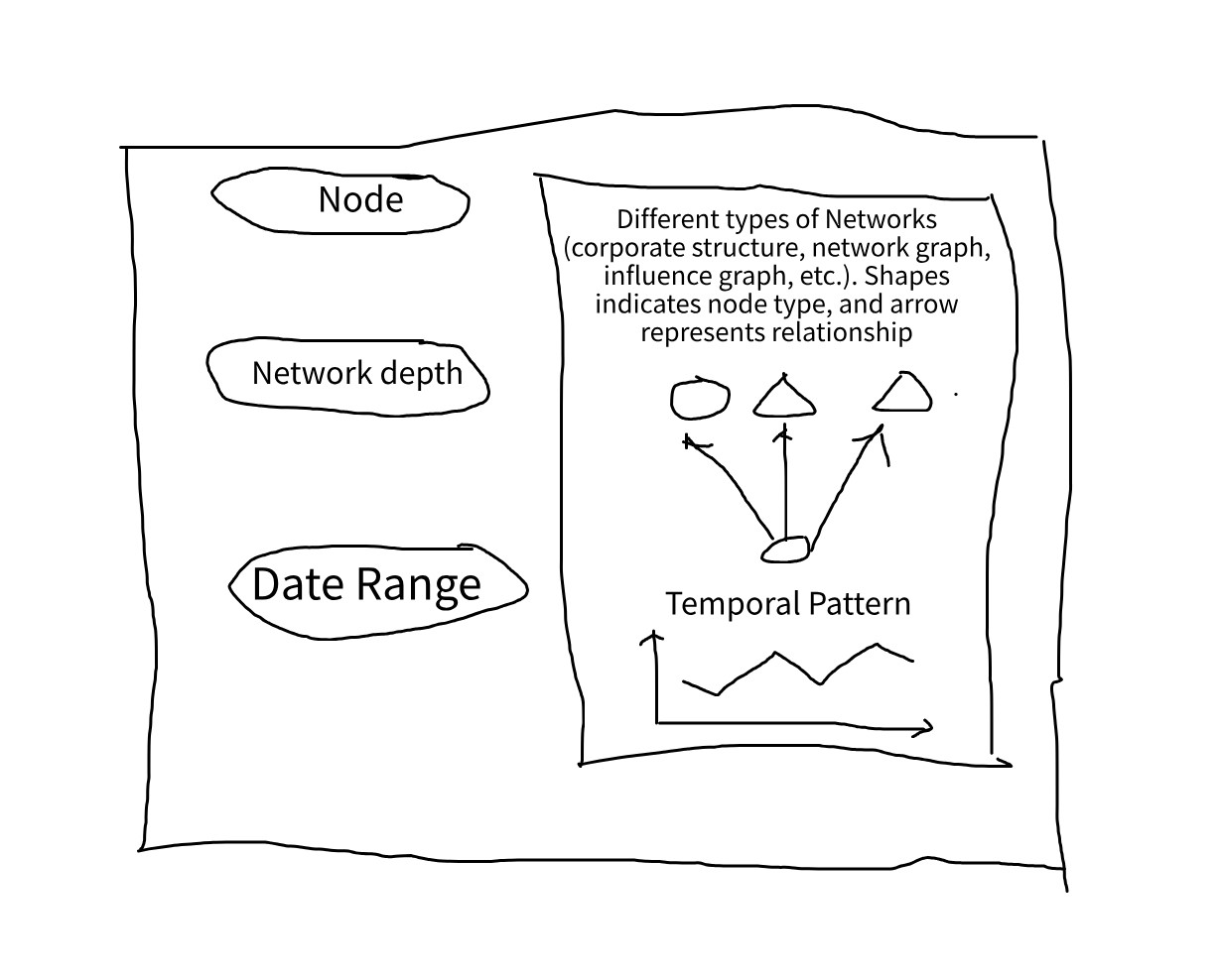
Our shiny app will look at network and temporal patterns, with the network graph as the core visualizations, with other tables and charts as accompanying visualization.
The Shiny app will have 3 main parts of the input
Reference Node
As the whole network is very large, containing of 60,520 nodes and 75,817 edges, it is not suitable to visualize the entire network.
Hence, we will use a reference node to narrow down the network and only render the nodes in proximity to the reference node.
Network depth
In relation to the reference node, this serves to narrow down the network to view. The depth dictates how far from the reference node to network.
As networks are of different sizes, some networks would be fully shown at distance 2, but for some distance of 10 is not enough.
Hence, we will add an option to toggle whether to render the full network or use the option to render by distance to the reference node.
Date
As we are interested in temporal patterns, we also need to know the date to use in rendering. This is used to filter which edges need to show, and nodes will only be shown in the graph if they are connected to another node at that point in time.
Plot area
Shows the network plot. It will be interactive to enable closer inspection of network elements.
Temporal graph
Shows a plot of attribute with respect to time (e.g. number of activities).
R Packages
We used the following R packages
shiny - Creating interactive apps in R
shinywidgets - Extensions of shiny inputs
shinyjs - Executing JS code in shiny for enabling and disabling Shiny inputs
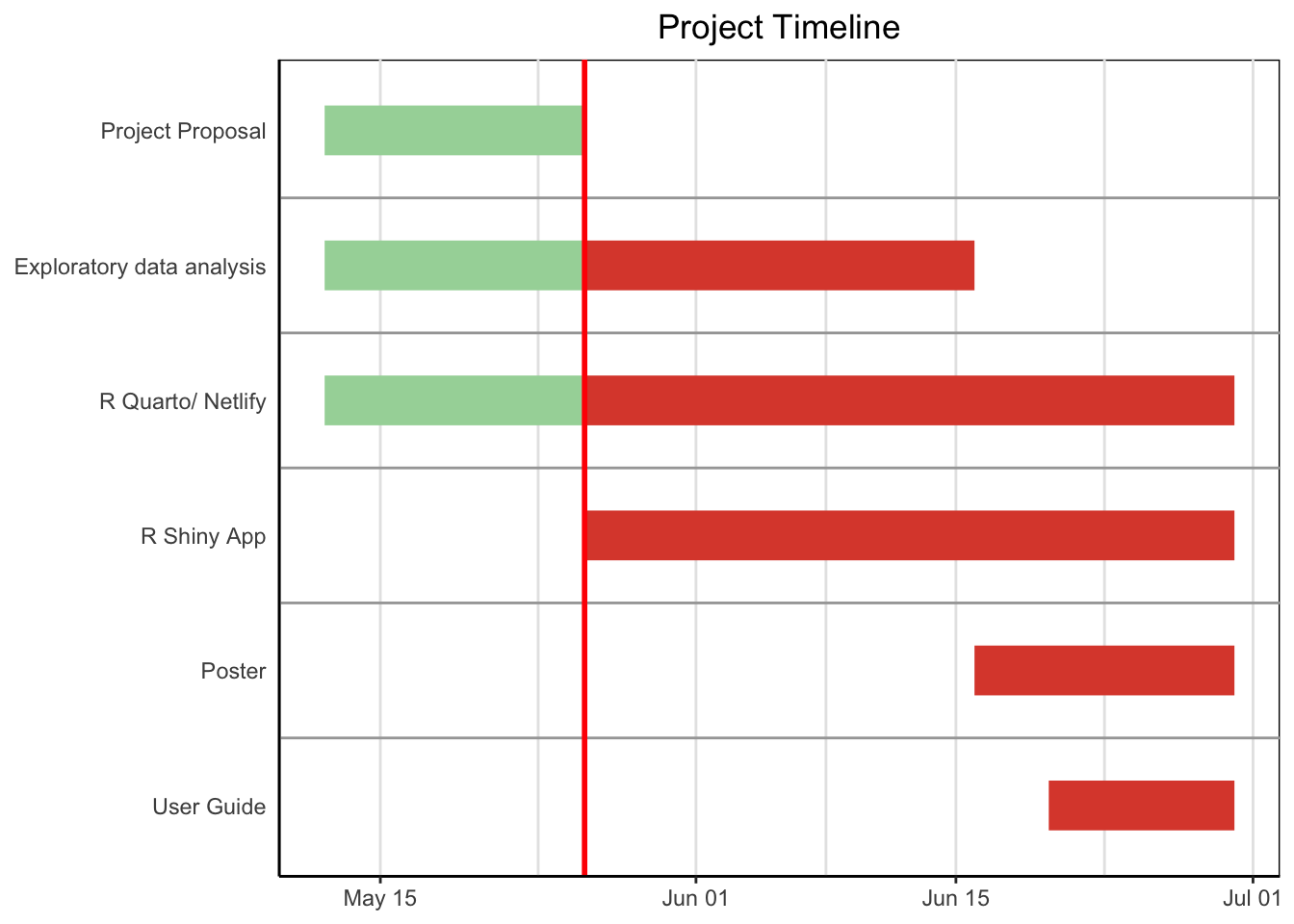
Project Schedule
Show code
pacman::p_load(vistime, ggplot2)
data <- read.csv(text="event,group,start,end,color
                       ,Project Proposal,2024-05-12,2024-05-26,#a5d6a7
                       ,Exploratory data analysis,2024-05-12,2024-05-26,#a5d6a7
                       ,Exploratory data analysis,2024-05-26,2024-06-16,#DD4B39
                       ,R Quarto/ Netlify,2024-05-12,2024-05-26,#a5d6a7
                       ,R Quarto/ Netlify,2024-05-26,2024-06-30,#DD4B39
                       ,R Shiny App,2024-05-26,2024-06-30,#DD4B39
                       ,Poster,2024-06-16,2024-06-30,#DD4B39
                       ,User Guide,2024-06-20,2024-06-30,#DD4B39"
                 )

proposal_deadline <- as.Date("2024-05-26")

p <- gg_vistime(data, title = "Project Timeline")
p +
  geom_vline(xintercept = as.numeric(as.POSIXct("2024-05-26")), color = "red", size = 1)